Description:
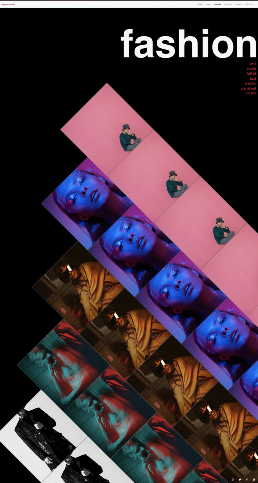
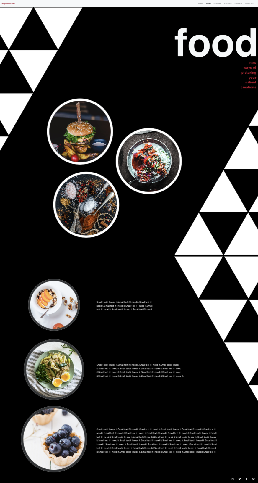
For a school project, I invented a photography/ graphic design studio called daguerreoTYPE, and created a fully responsive website for it. My idea with using a design studio for this project let me go in a modern and graphic direction with the design. The food, fashion and graphic design pages are pretty funky in terms of design, and the fashion and poster pages will link to short webpages that include more information about the subject.
Context:
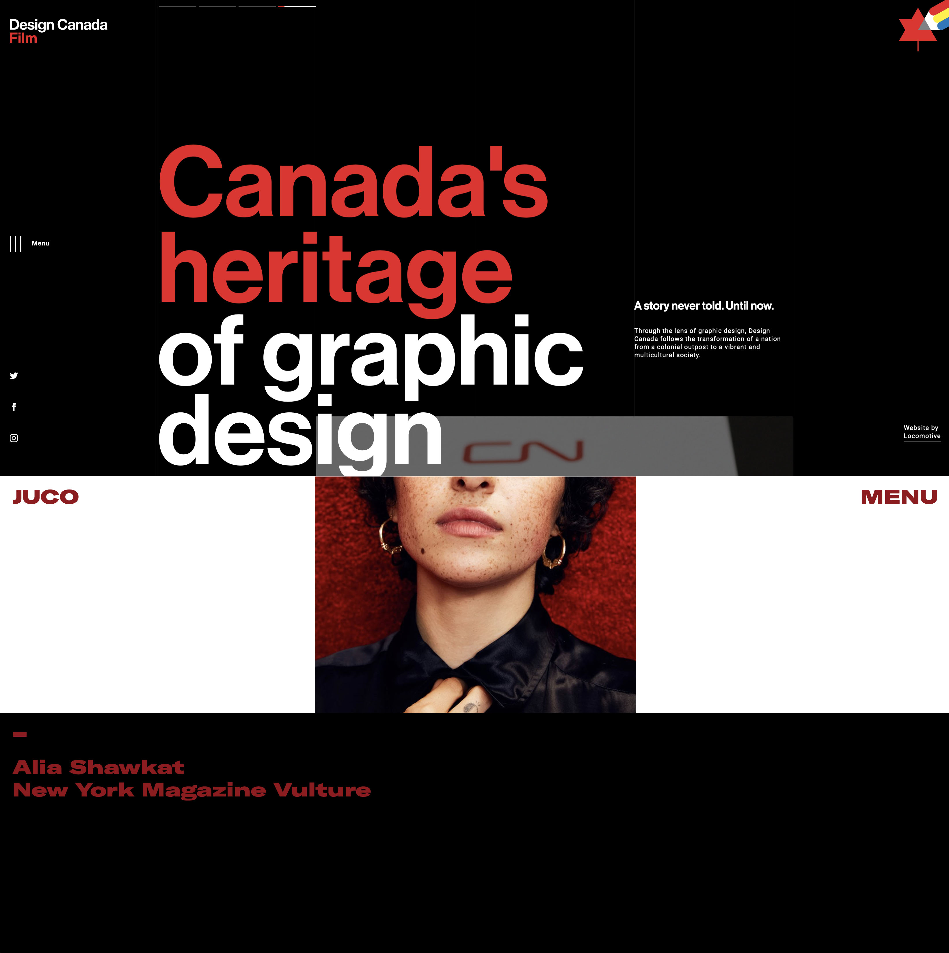
I started out by looking at websites that inspired me. I hoped to keep body copy to a minimum and let the large type and images do the talking, like in Design Canada or Juco Photo.
As this was a school project, I had two weeks to design and two weeks to develop this website and so I budgeted my time accordingly and got to work as soon as I could.
Process:
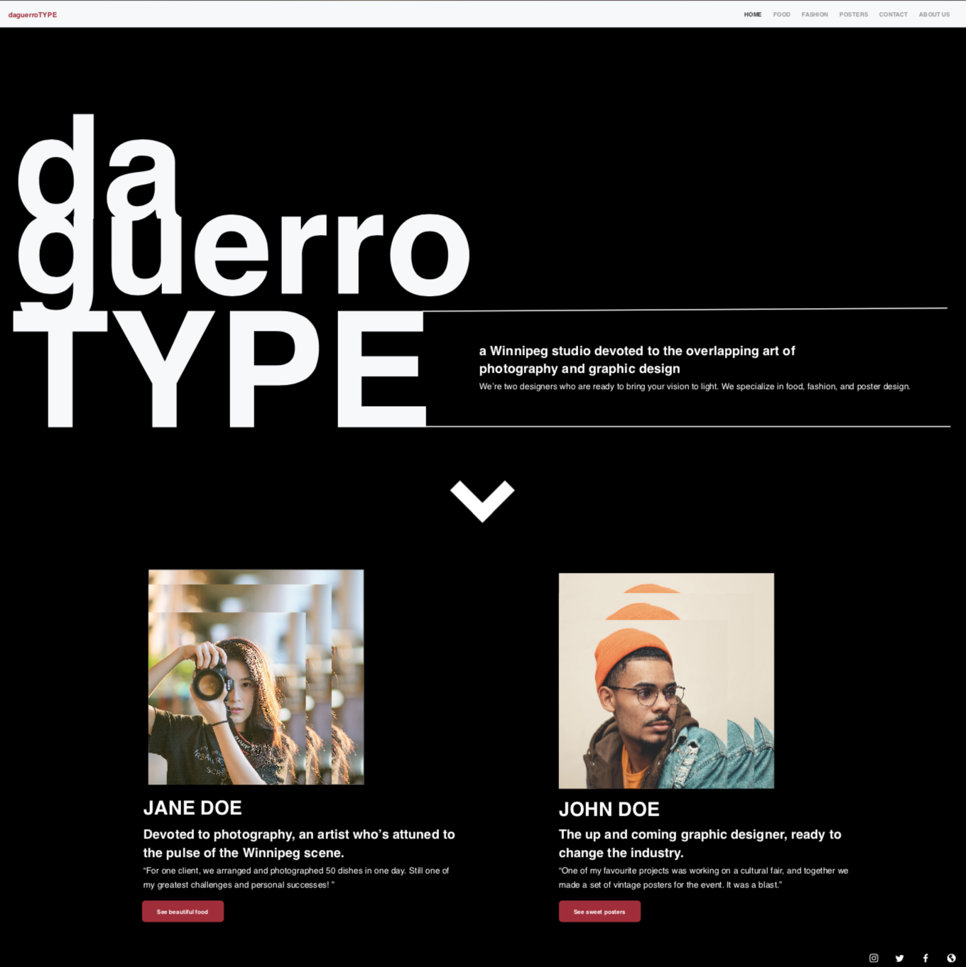
Once I had my ideas for the look, it was only natural do invent a sort of design studio to fit the bill. I felt like a duo of a graphic designer and photographer would do perfectly, and through some mind mapping and brainstorming I came up with the name daguerroTYPE, which both had a nod to typography and to photography’s roots.
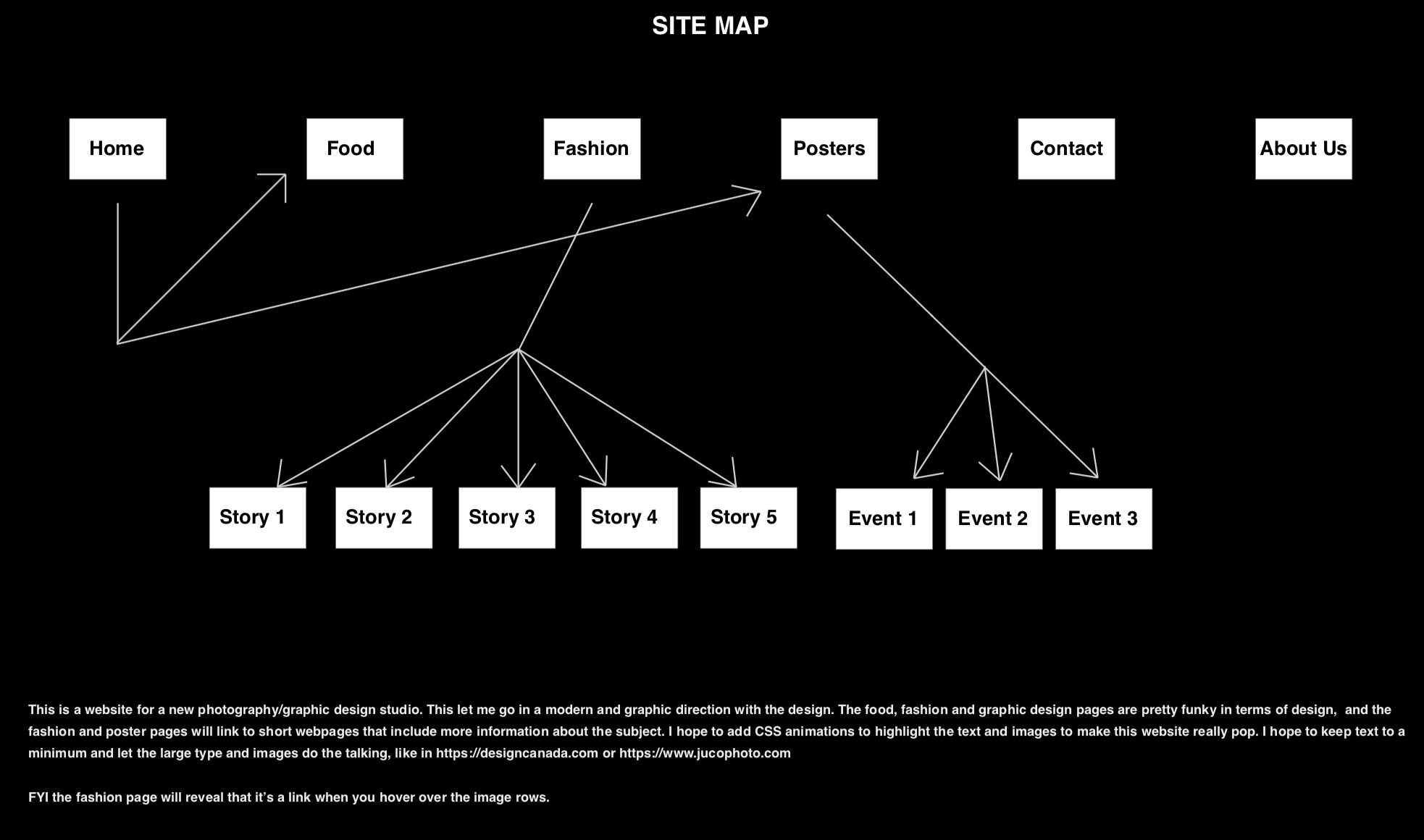
In Adobe XD, where I would do the wireframing and mockups of three mobile and desktop pages, I started out by creating a sitemap. This would be my guide for how I would organize the pages, and the layout as a result.
Next I started to design the desktop pages. Along with some body copy, I used images from Pexels to flesh out the different sections. As you can see, I took care to use geometric influences, and so you’ll see triangles, squares, and circles as graphic elements and as image masks. Once the desktop designs were done I then used them to create the mobile pages. Then, it was time to take the design work I had done and make it real!
Outcome:
In the end, I created what I had set out to with a couple extra pages too: a “wip” page and an article page for the fashion page links. Thank you for reading! Here is the link to the website for you to browse my project. Make sure to check it out on mobile, too!
Looking to get in touch with me? You can email me with any inquirires or questions at . I would be happy to answer any questions and set up a meeting with you.