Description:
No Fun Club is a new music and artist hub that was looking to replace their existing static website with a site that would allow them to easily edit the content, run events, and moderate a site forum. With that in mind, I designed and developed a WordPress theme for them. I worked with the client to redesign the website branding and imagine web page looks using Sketch, and then developed and taught them how to use their new website. Among WordPress’s default utilities this project included developing custom stylesheets using Sass, a unique front page php loop, and an interactive forum for the site users.
Context:
During our first phone meeting, No Fun Club indicated that they were finding their old website to be clunky to update since they couldn’t edit it themselves, they were interested in redoing the graphic design of the site, and they wanted to add significant functionality to it as well.
For this project, I divided the work into five sections:
- Analyze what the competition is doing with their websites
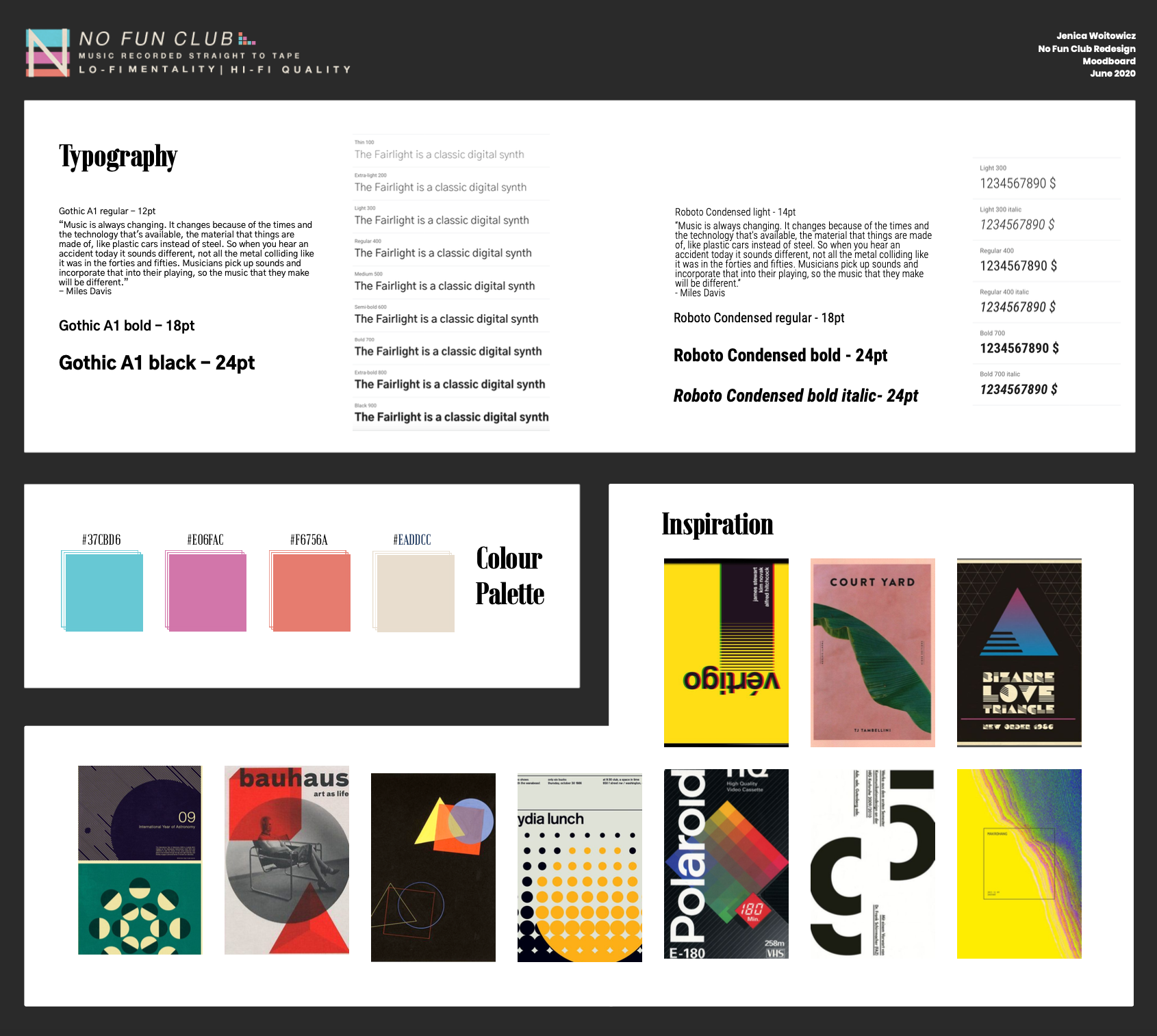
- Create a moodboard for the redesign
- Design multiple examples of front pages and some interior page looks
- Develop the new theme, create the new pages, and migrate the existing content over
- Work with Rob of No Fun Club to teach him how to use the new site
Process:
To start, No Fun Club and I looked at what other music recording businesses were doing on their websites. In both local and national websites, we were attracted to the idea that No Fun Club could stand out in terms of visual design but also in what the website could offer. Our main focus to start was to pursue a visual style that would to use the colours from the logo as a splash of colour to show how fun and quirky the studio is, but staying inside a professional boundary.
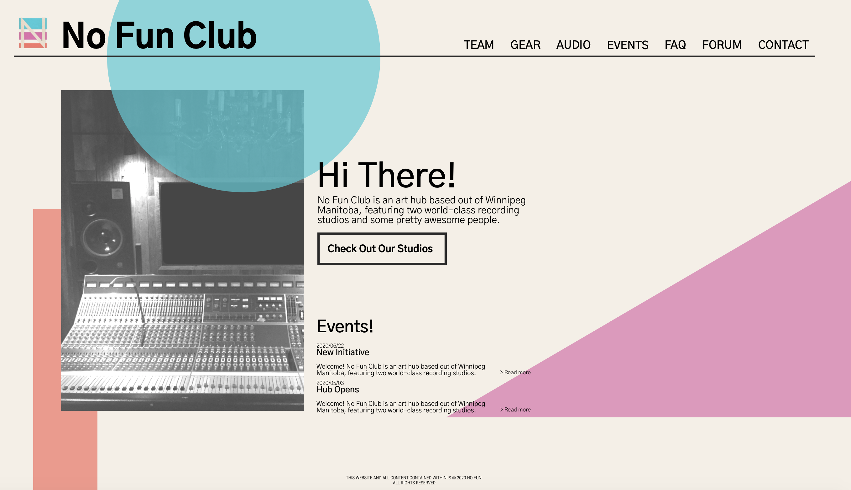
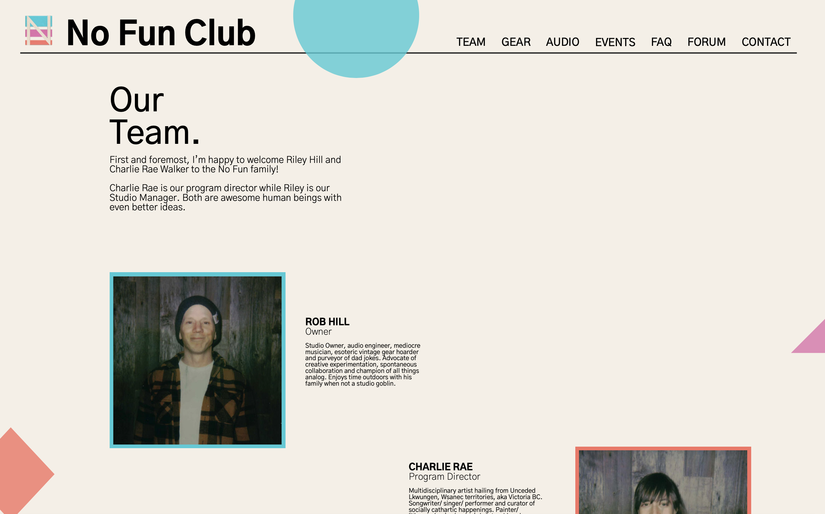
The moodboard process was a built from a combination of Rob’s visions and inspirations for the style, combined with my knowledge of typography and colour. I created a dark version and a light version but we ended up seriously pursuing the light version. With the moodboard as a guide, I began to design preliminary ideas for the front page, which would be my focus as the WordPress theme developer. In three rounds of revisions with multiple examples of the front page and eventually an interior team page as well, we were able to narrow down the design to one that included large solid shapes from a bauhaus inspiration into our design.
Once the designs were approved I moved into the development phase, where I used WordPress’s theme unit test content to ensure my designs were responsive and properly tested. The front page of the design is partially made using the Gutenberg editor, and partially done through a custom php front page to display the top two events at all times. Elements to focus on in the development included the responsive menu, a context sensitive widget area, an editor view that closely resembles the final view, customized archive pages, and incorporating and styling plugins for the forum and contact pages.
In the end, since I was not in change of putting the new content in the website, I spent time one on one with Rob Hill, owner of No Fun Club and showed him how to use the site and show how I had arranged the pages using the Gutenberg block editor with his old website’s content. Within a couple hours he made good progress with understanding how he could edit, customize and use his website.
Outcome:
Thank you for taking the time to read this case study about my work with No Fun Club! It was my first freelance project out of college and my first attempt at working with clients during the pandemic. You can visit their site at nofunclub.com and take a look at the final product in action.
Looking to get in touch with me? You can email me with any inquirires or questions at . I would be happy to answer any questions and set up a meeting with you.