Description:
In the summer of 2019 I was hired on by the Government of Manitoba through STEP services to methodically audit the internal website for Business Transformation and Technologies (BTT) and redesign it. Their original intranet site had been created in Microsoft Sharepoint, and the hope was to create a new website in something modern like Wordpress. While the built in synergy with Microsoft software was an asset, the site as a whole had become so bulky and hard to navigate and was beginning to show it’s age.

Context:
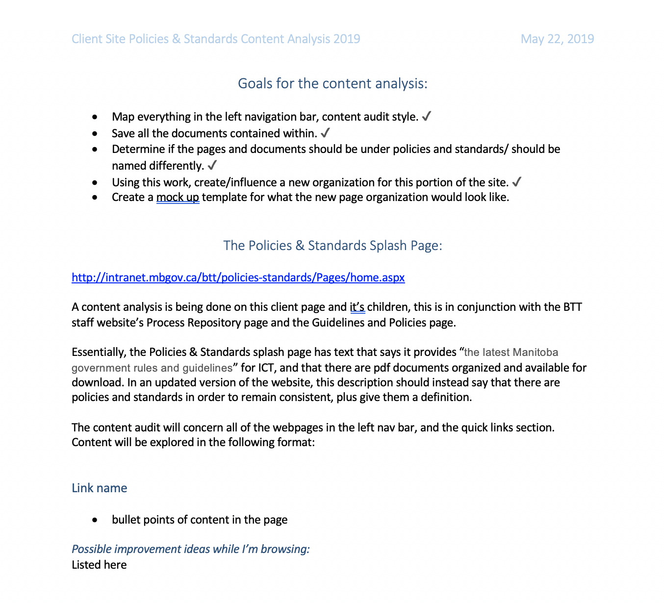
Given something as massive and important as a government website, I had many pieces to juggle. The website I was tasked with redesigning had over 500 pages that all needed to be looked at and determined if they needed to be deleted, updated, or if they could be kept as is. Some examples of content that I would be looking at was:
- Official Policies, Standards and Procedures and their respective documentation
- A way for BTT to showcase their current projects and initiatives
- A link to BTT’s customer support which included their own web and phone support processes.
Process:
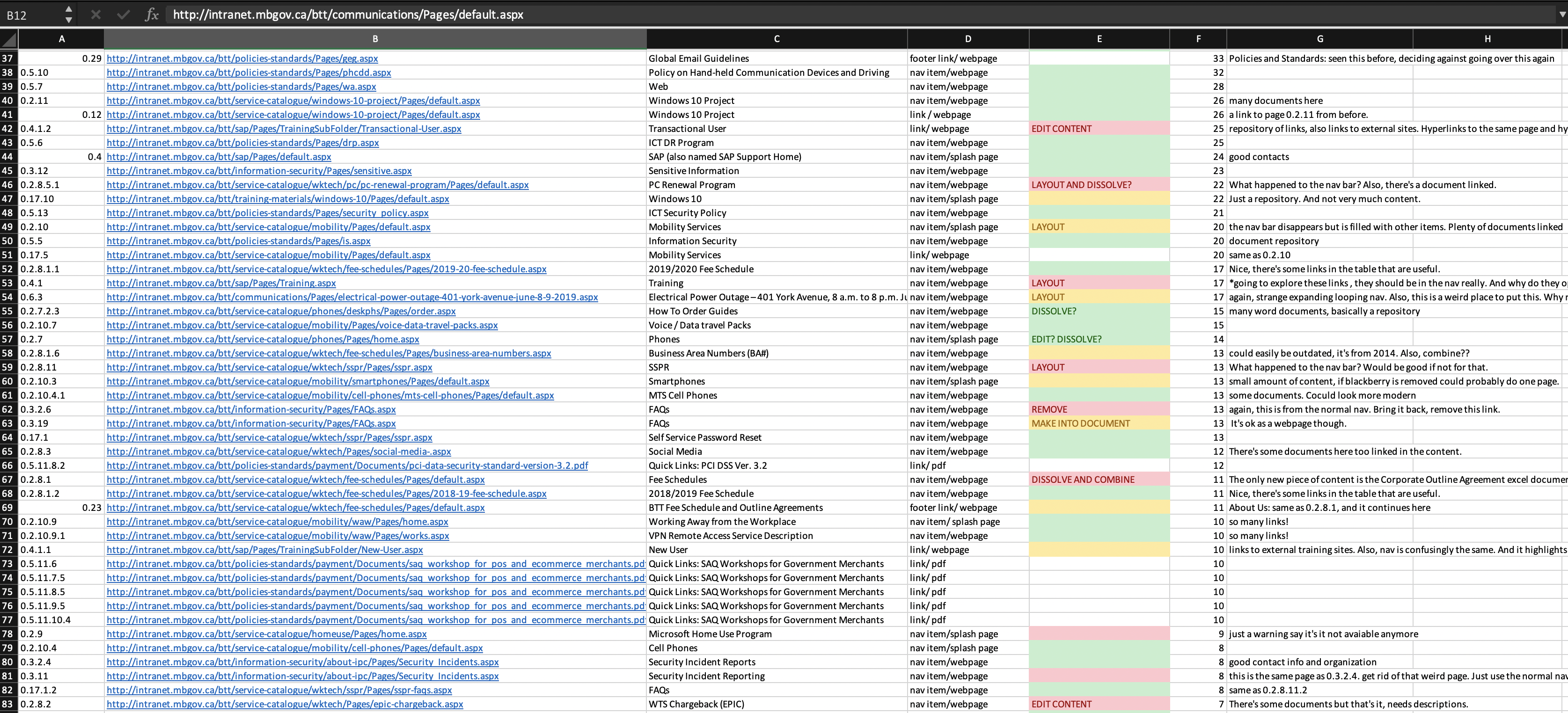
To start, I was tasked with creating a sitemap and auditing the website. This meant going through each page of the website, saving all the content, and recording certain facts about it. I started by writing down the path, the URL, the page title and topic, what type of content it was, if it required action, and any other details. Upon coordinating with others in BTT, I was able to cross reference these pages with an excel sheet of hits from a month of usage and included the number of hits in my site crawl. With this master list, I could then go through and see how the website was currently being used.
But of course I was hired to change the way the current intranet site was being used, so with this master document I started analysing each section of content on how it could be changed. Most of my proposed changes were structural in nature. I found that a lot of information was difficult to navigate to, and as a result of this some hard to reach sections had dead links and out of date material. It was also obvious to me that this intranet site was maintaining many different iterations of itself, some from recent years but others from the 2000’s. My primary job was to take all this material and using my knowledge of information architecture, restructure the website.
My goals as a web designer, and in conjunction with my bosses was as follows:
- create a smaller top nav from 14 items to around 7 items
- unify language and navigation schemes throughout the site to aid user experience
- make general edits to content so that everything is up to date and promotes what BTT thinks is most important to it’s employees
- keep within the existing design guidelines from the government
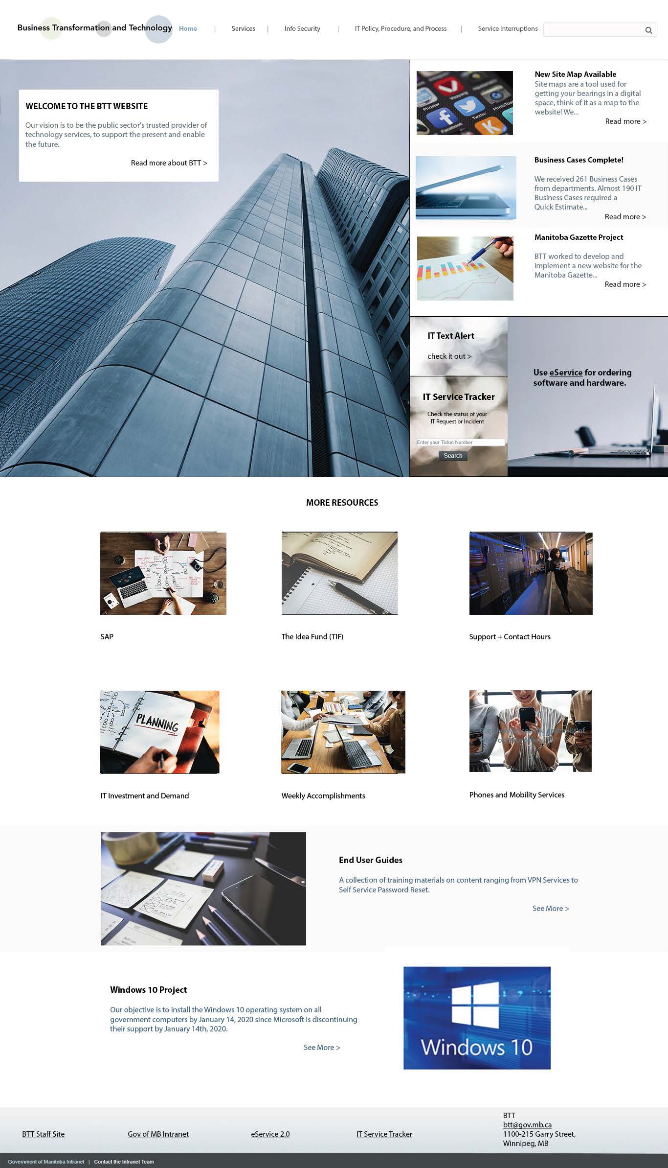
With this in mind, I used Adobe Photoshop to start making wireframes for the new website, and then made mockups. I focused on making mockups of five key pages: the home page, and then four other pages that had a decent amount of content revisions.


Outcome:
In the end, this project ended up being delayed for a couple reasons, but I was still able to give BTT a redesign that they would later be able to pursue with a WordPress developer at Relish. It gave me a great opportunity to see what working in a big organization would be like, and I was able to do exercise my skills in information architecture and design. To get a good look at it, you can download a pdf of my page mockups!
Looking to get in touch with me? You can email me with any inquirires or questions at . I would be happy to answer any questions and set up a meeting with you.