Description:
During the end of my schooling at Red River College, we were tasked with taking an existing website for a magazine and redesigning it with a UI kit, and mockups of the new pages as if they were WordPress templates. I have fond memories of jazz band in high school, and so dig! Magazine was the perfect fit for me to redesign. I used Sketch for both the UI kit and the mockups on this project.
Context:
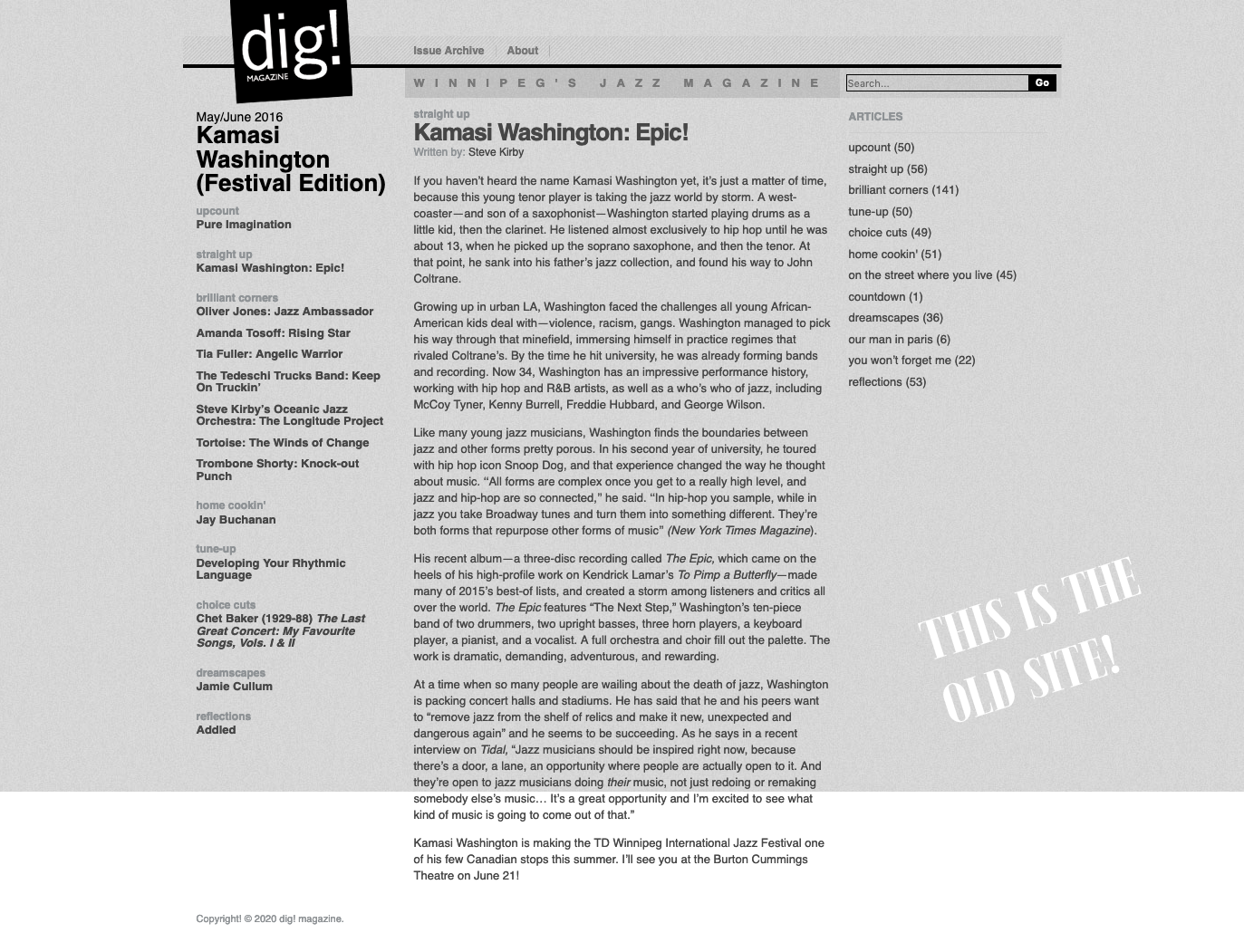
Once looking at the old site, I started to establish pieces that I thought could be improved and began to work on my own design principles. Colour palettes, the typographic scale, form elements, and an icon library were all a major focus here.
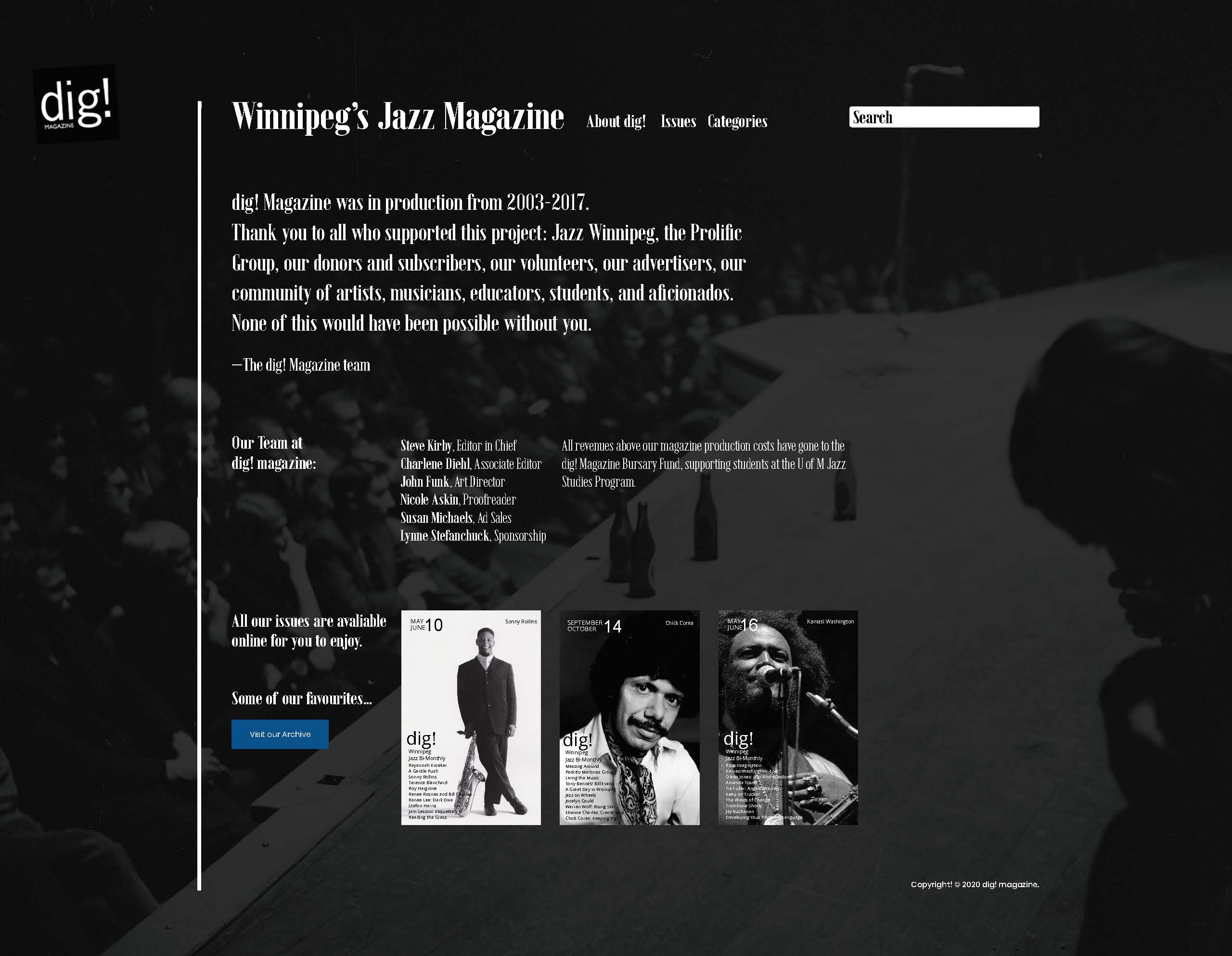
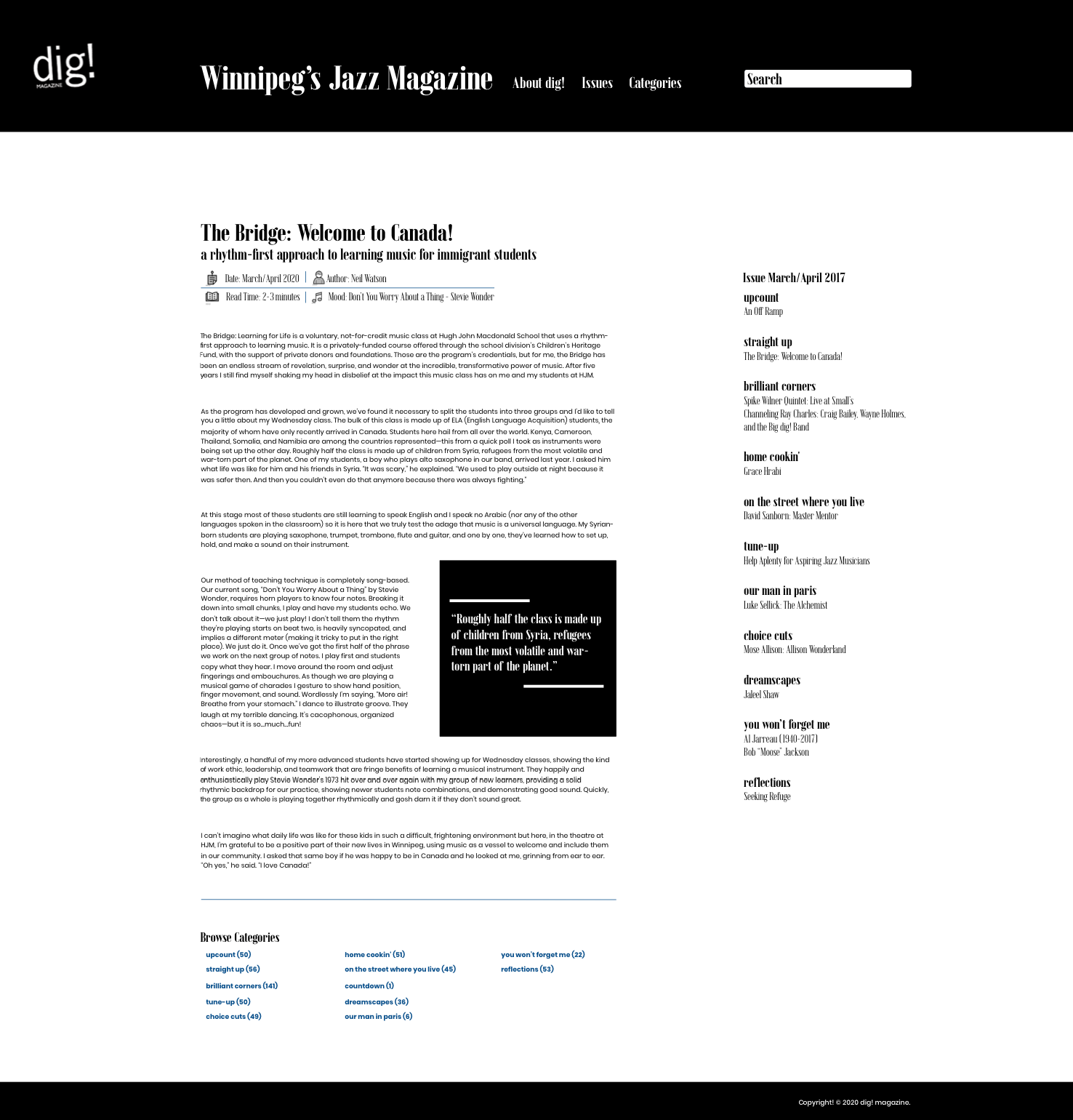
The target market for Dig! Magazine is varied, since it’s a small publication and they are trying to reach out to any listener of jazz in Winnipeg. This varies from jazz bands in public schools, to older patrons who would have subscribed to this six issue a year magazine. With this, I knew I couldn’t take user’s knowledge of websites for granted, so my design choices would focus on usability over a flashy style.
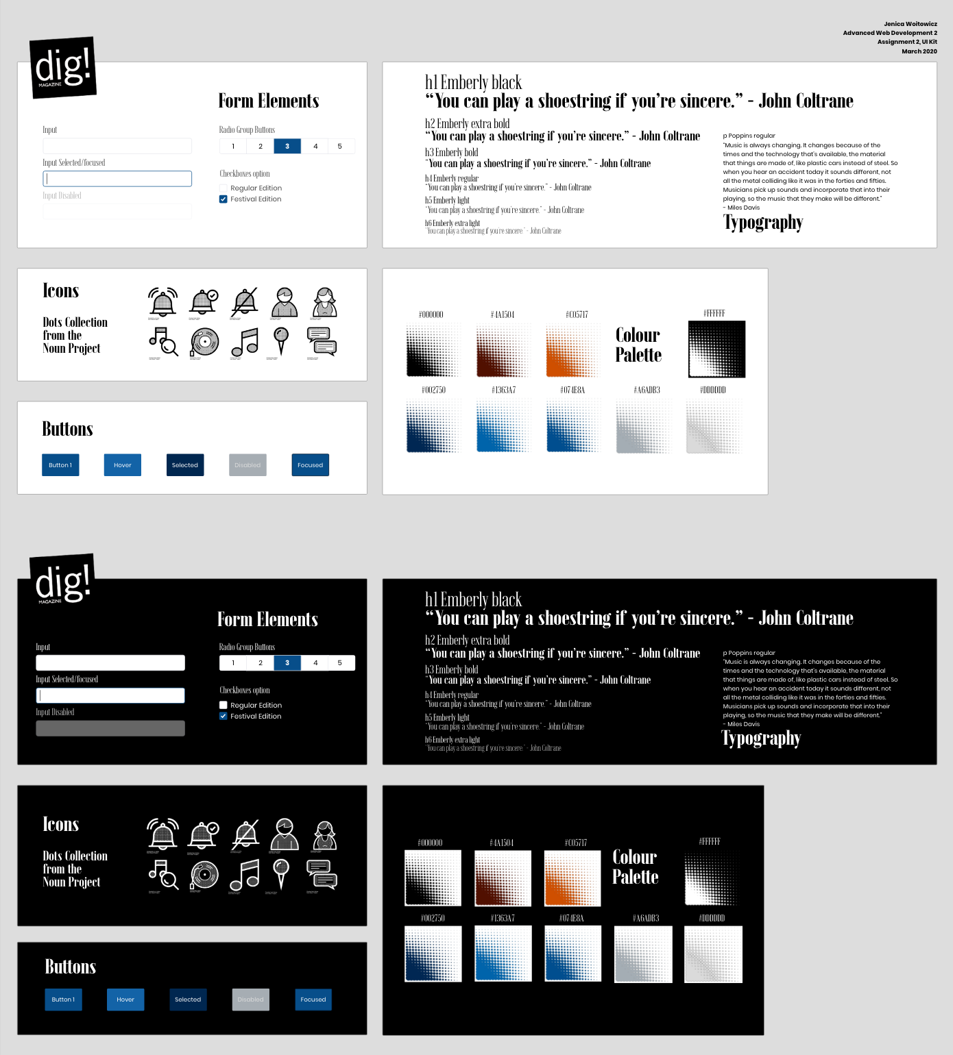
My buttons and form elements all look like classic versions, with a light stoke when needed and clear states to differentiate what is happening to an element at any particular time. There are many shades of blue for this exact purpose on buttons, and they all the colours fit web contrast standards.
Since 1939, Blue Notes records has been a major inspiration both visually and sonically to jazz artists, This record company is what inspired me to use the Dots Collection from the Noun Project for my icons, and Emberly for my header fonts (and of course using blue and sometimes orange for the main accent colours of the website). Some unifying themes from Blue Notes is flat designs, a solid colour, maybe two, and strong typography which I was emulating.
The Dots Collection uses halftone dots to shade in the darker parts of the icon, and I used it based on Art Blakey & The Jazz Messenger’s album cover for Indestructible. It harkens back to the vintage days of jazz, while still having many modern icons in the collection. In addition, I liked how each icon was not so minimalist as to confuse users as to what each icon was.
Emberly is a serif font by Rajesh Rajput that comes with three widths and 54 styles, which makes it a great choice for design. While I wouldn’t be using every style on a live website, it’s Didone inspired style works great as a display typeface and I found myself using it’s different weights in my headings. Combined with Poppins as a round but clean looking body font, it provides contrast through it’s sharper angles and condensed kerning.
Process:
When I started using the design kits in my mockups, there were a couple areas that I had to change. The main area of concern to me was the typography. The sizes on fonts I was using had to be adjusted because I found that I needed more variety to achieve the designs I wanted to design for the homepage. In addition to the size the accessibility is important to a magazine website and Emberly was getting too small to read when I was using it on the site. Changing the two smallest headers to Poppins fixed that issue.
I designed a homepage and article page for the magazine together, using my new and improved design guidelines. As a part of this assignment, I took 3 areas or components of the website and did A/B testing with 5 users. I used the meta area of the articles, the article archive section on the front page, and the search bar as my areas to test. After doing testing with 5 users, I was able to incorporate the best parts into my final designs.
Outcome:
I believe I have made a website redesign that dig! Magazine would be proud to have. I really enjoyed using the history of jazz, my own personal taste, and user research to make this design.
Looking to get in touch with me? You can email me with any inquirires or questions at . I would be happy to answer any questions and set up a meeting with you.