Description:
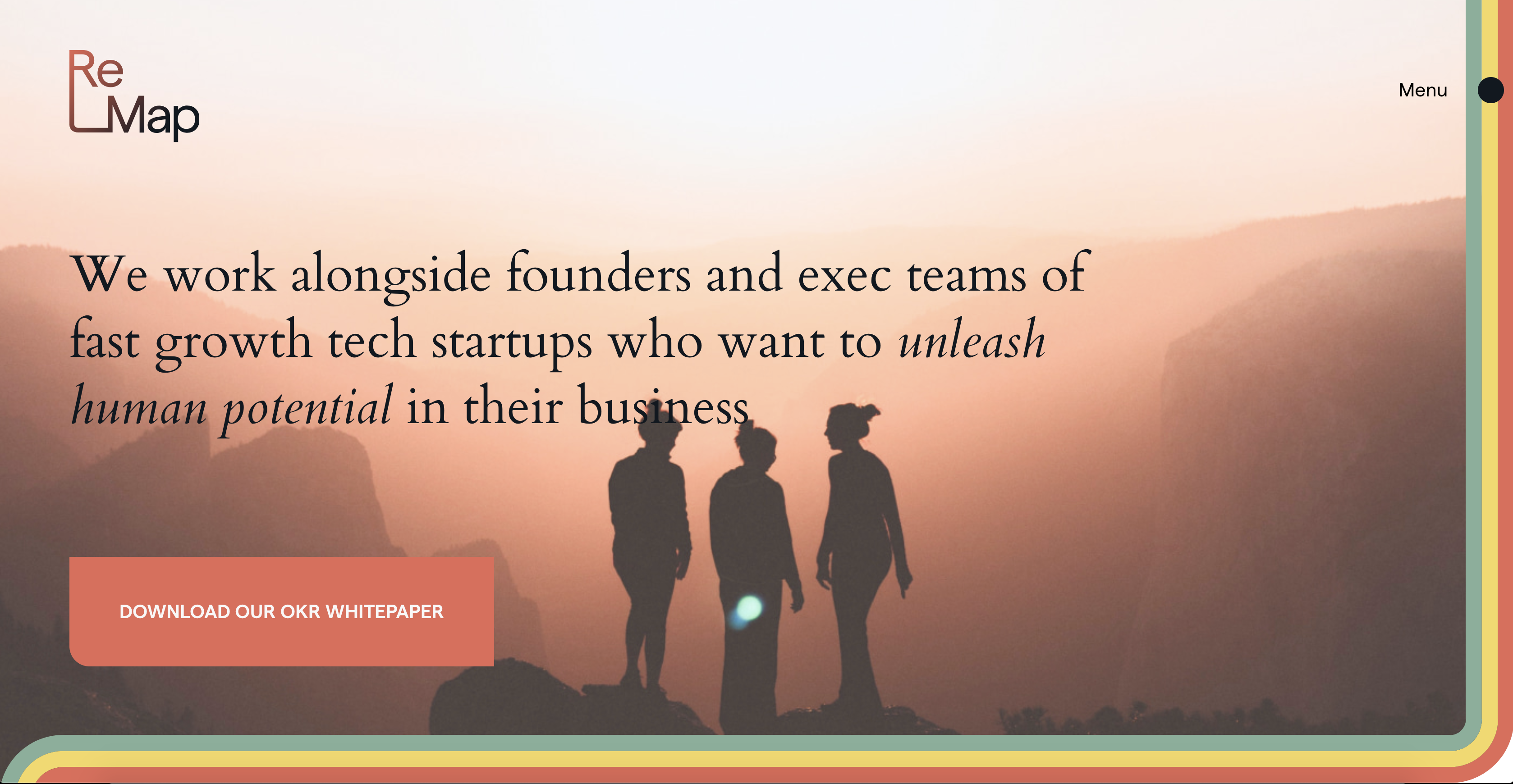
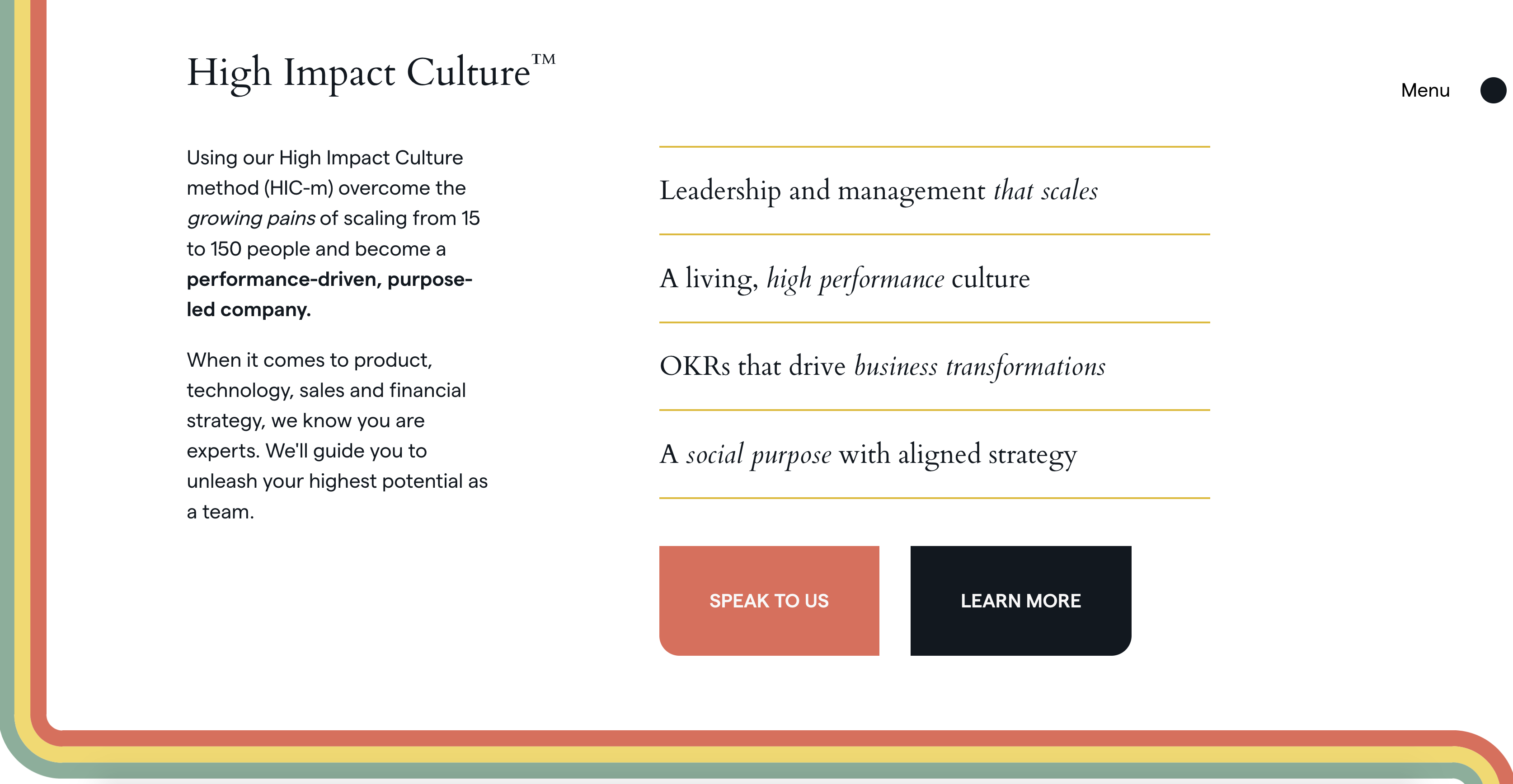
Re-Map is a Barcelona-based business that deploys a method called High Impact Culture to help performance-driven and purpose-led businesses scale. While working at Manoverboard, I was tasked with co-developing this jamstack website for them with my coworker Nicky Wolfe. This project involved learning to code in markup and liquid, using the Jekyll static site generator. There was special focus on Re-Map's new branding, as Manoverboard also created and implemented their new identity.

Context:
For this project, the process went something like this:
- Once the identity for Re-Map was confirmed, and then designs are completed and approved, we set up and start coding a local jamstack site using Jekyll
- Create dev proof one, which looks exactly like the final end-product while faking some functionality
- Dev proof two is where the site gets fully integrated with the content editor CloudCannon and the functionality is finished and perfected
- Finish responsive work and test for level A WCAG accessibility, cross browser testing across many modern and older browsers, and any remaining QA items
- After the polish is all done, work with the client's IT to launch the site!
Process:
This wasn't my first jamstack site, but it was one where I would be taking on the majority of the dev work for the first time. The initial setup is where most of the cognitive load lies when learning; from using the command line to create your jekyll site, using liquid to create custom pages and posts, and using Cloudcannon's functionality to set up file editing in a user-friendly way. That being said, static-sites really benefit from their streamlined design, and once you've done it a couple times this process is no big deal.
Concerning this site design itself: we had each page type change colours and change colours. This is all done dynamically, other than on general content pages where the user can choose the accent colour. The development ensured that this was easy to per page, and that each page type was clearly deliniated in the website backend for a better user experience.
Key parts of development on this site included:
- Custom forms for the contact page, the footer, and other key pages
- Loops where the user can reorder the pages within
- Creating page layers that allowed the metro motif to flow from item to item
- CTA designs that changed per page type
To launch Re-Map, we ended up using Cloudcannon's UI for any content editing, Github for holding the files, and Netlify for the site hosting. We were all so pleased to help create a super performant website that is so streamlined in purpose.


Outcome:
Thank you for taking the time to read this case study about my work at Manoverboard! I'm loving creating jamstack websites, and am so excited to do more. You can visit their site at re-map.io and take a look at the final product in action.
Looking to get in touch with me? You can email me with any inquirires or questions at . I would be happy to answer any questions and set up a meeting with you.