Description:
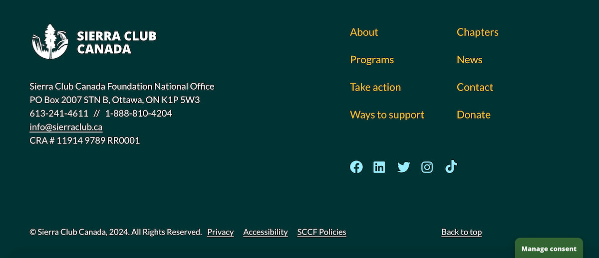
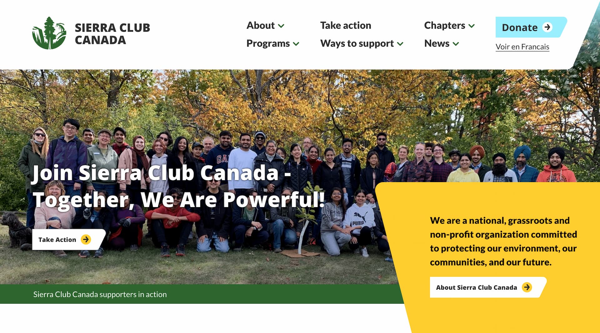
The Sierra Club Canada Foundation is a nation-wide non-profit that empowers people to be leaders in protecting, restoring and enjoying healthy and safe ecosystems. I was thrilled to develop a custom WordPress website for them alongside my colleague Daniel Lamb at Mangrove Web. The site was customized to meet the growing content needs of the organization, and allow for easy, secure administration. This was a large bilingual project that required level AA WCAG accessibility standards, as well as a small page size budget to accomodate those living in remote areas of Canada.
Context:
This is a project that was large in scope, and required multiple proofs that each had many moving parts. Karen Niedzwiecki made the design, and at multiple points in that process she would check in with us developers for input. From the outset, when planning out the website development Daniel and I were concerned with a few things.
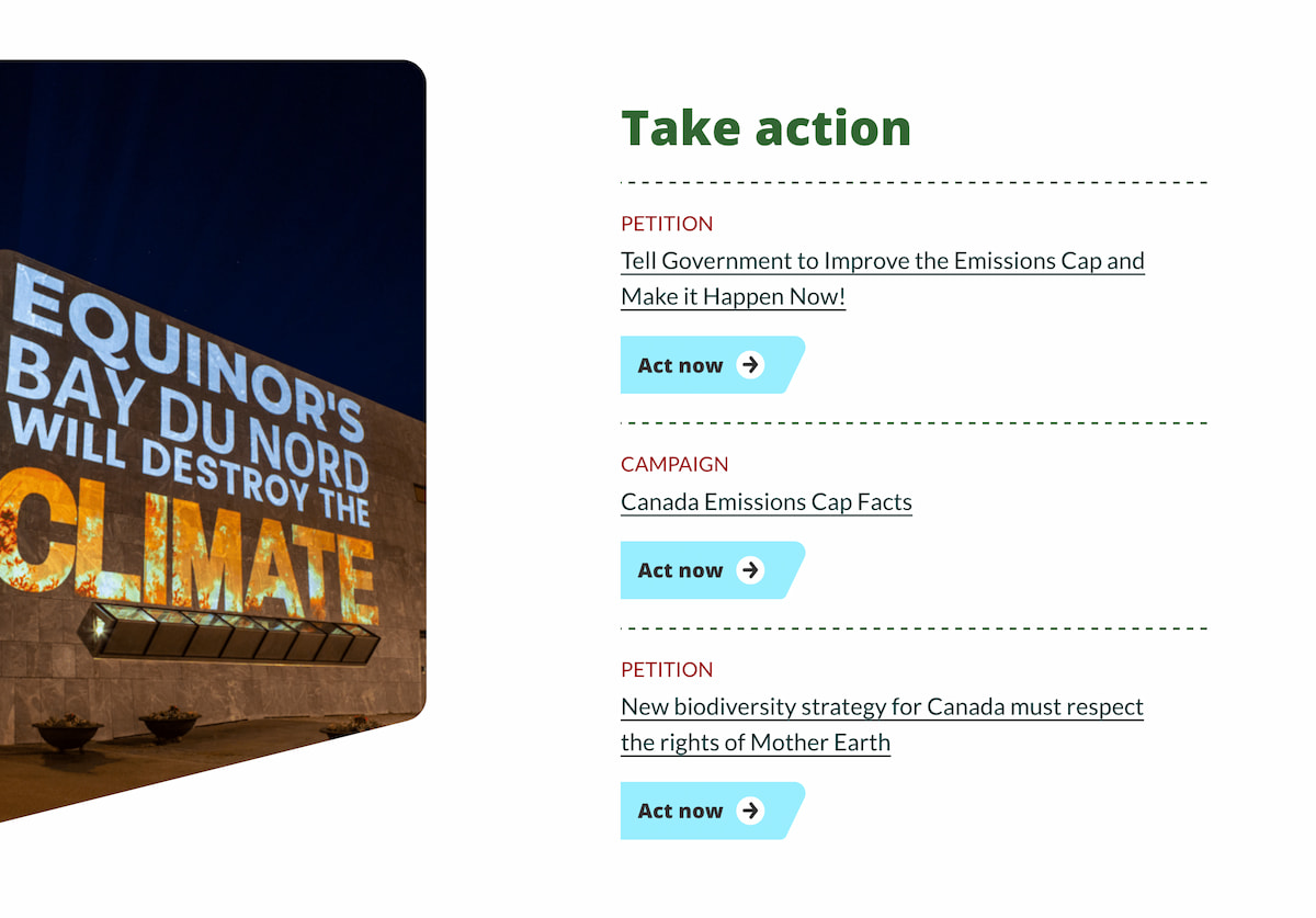
- We were tasked with integrating the CiviCRM API into the site for things like donations, petitions, and other forms
- All site content needed to be in both official languages of Canada, French and English, and we would use GatherContent to collect it prior to website development
- Each chapter of the organization has their own coloured branding, their own news and events, and their own homepage which would need to be reflected in the website
- Sierra Club Canada's growing popularity meant that we would be integrating Google Analytics as well as a Meta pixel to keep track of ineractions, which meant a cookie bar and privacy policy would need to be on the site
- At every step in design, content entry, and development, we would be auditing and building the site for AA accessibility
Process:
The build for Sierra Club took many months, as there were four development proofs with plenty of work to be done by all parties. We used QA software such as Bugherd and BrowserStack extensively.
There were many page types on this build that were all coded with Advanced Custom Fields (ACF) that had multiple taxonomies and tags, and would be integrated into the page content based on context.
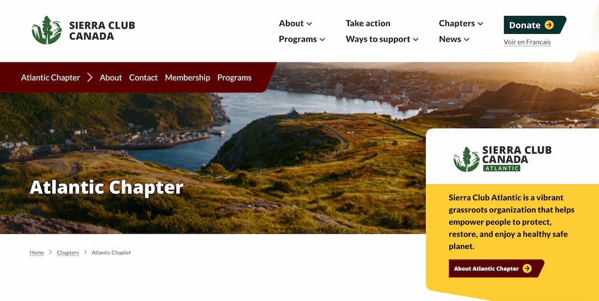
For instance, when you visit the Atlantic Chapter page, it has it's own:
- Menu bar with it's own specific subpages
- A custom logo specific to the chapter appears in the hero
- Petitions, Campaigns, and Webinars that are tagged with Atlantic Canada populate the Take Action block
- News Articles specific to the Atlantic chapter poopulate the related news block
We are so pleased to create an eco-friendly website for such a great client. In fact, you can hear me speak about the build and how this project and it's many complexities came to be on the Sierra Club podcast. You can also listen to the episode on their Soundcloud page.
Outcome:
Thank you for taking the time to read this case study about my work on this WordPress site! You can visit their website at Sierra Club Canada and take a look at the final product in action.
Looking to get in touch with me? You can email me with any inquirires or questions at . I would be happy to answer any questions and set up a meeting with you.
