Description:
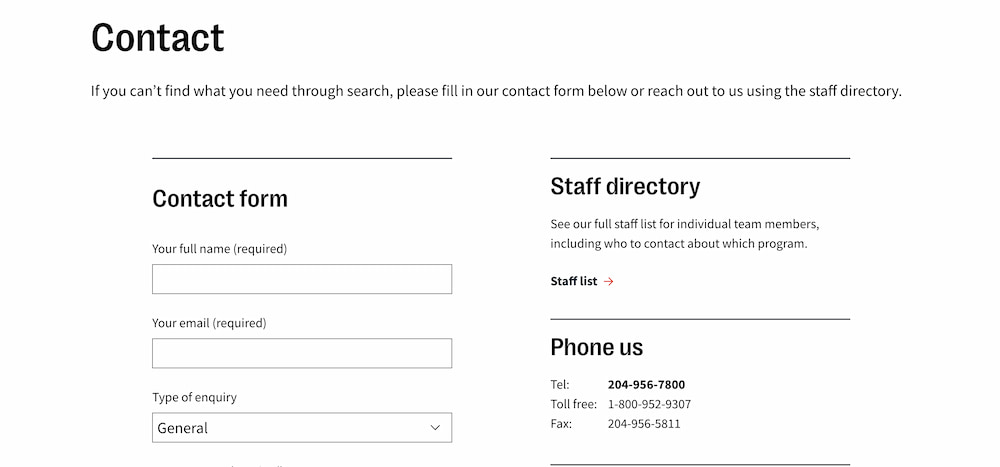
The National Screen Institute (NSI) is a Canadian not-for-profit organization that supports storytellers to create a better world. I developed this world-class WordPress website with my colleague Daniel Lamb while we were working at Manoverboard, and subsequently finished the project at Mangrove Web. This project featured level A accessibility guidelines, an extensive budget of page types and coded layers for content, all while integrating old and new content with the brand new identity.
Context:
Working with NSI on their website redesign was an immense pleasure for our team. This was a project that included an identity redesign, and then a subsequent redesign of the website. It was large in scope, and required multiple proofs that spanned from 2022 to 2023. There was a lot of planning required, and the requirements looked something like this:
- CMS platform: WordPress, though it may or may not be Gutenberg
- Accessibility level: A guidelines
- Optimization: A page budget of 2.5 MB, and video that loads quickly
- Migration needs: news/blog content from the old website
- Third party integrations: Multiple forms, such as Canada Helps, Mailchimp, and Gravity Forms
- SEO and Analytics: Adding Yoast SEO, Google Analytics, and coding in a custom search page
Process:
The site that we developed for NSI had a total of 12 page types, and were all coded with Advanced Custom Fields (ACF) that had multiple taxonomies and tags. We used QA software throughout the development process such as Bugherd and BrowserStack. Any Accessibility testing was done manually, which would ensure proper conformance.
Some pages to highlight:
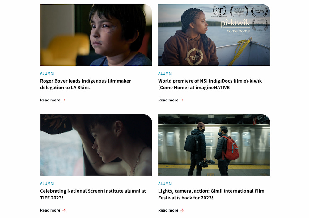
- The news page, which has a featured news post, a filterable archive, and also features media releases at the bottom.
- The history page which features a custom CSS timeline.
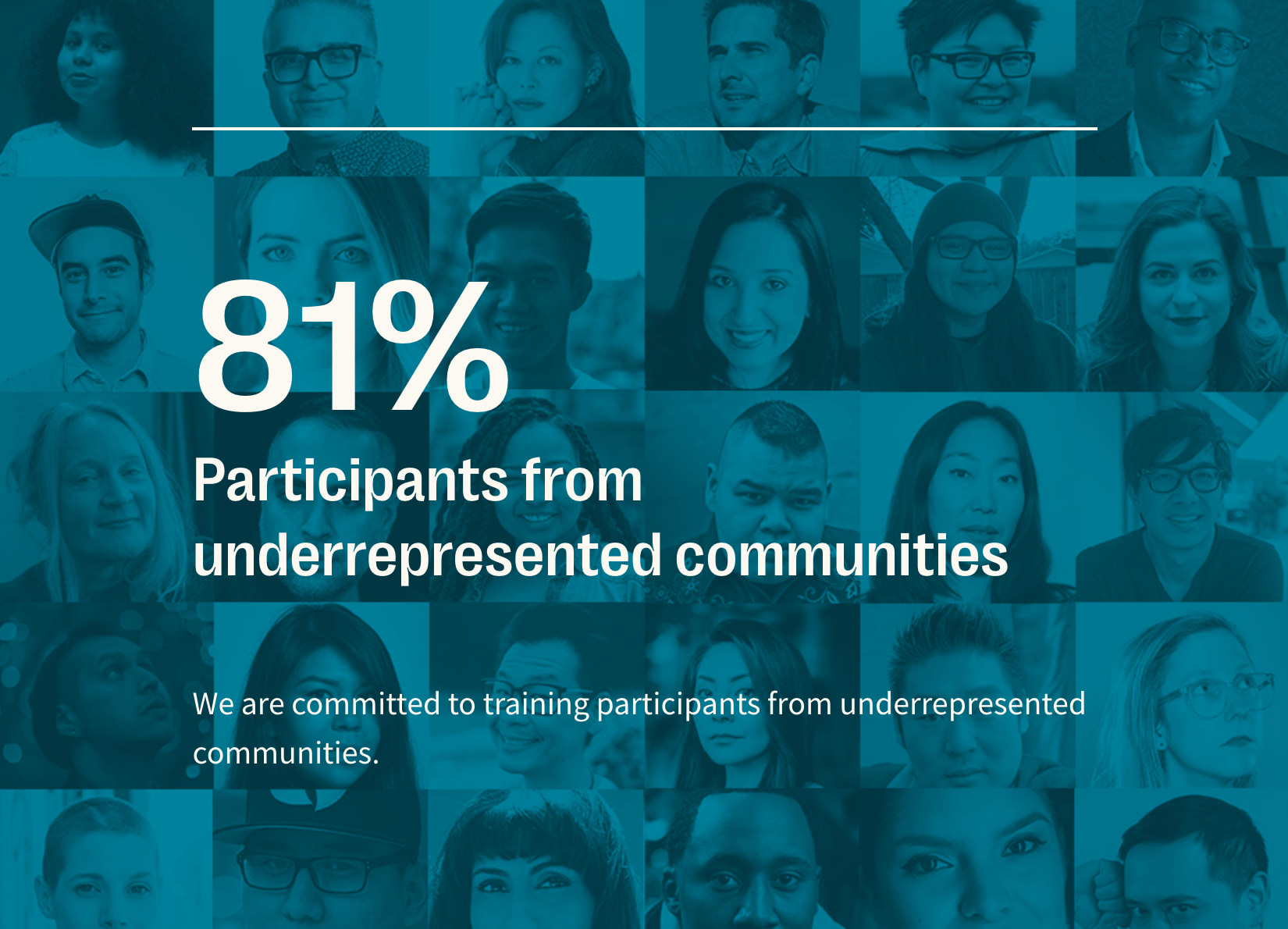
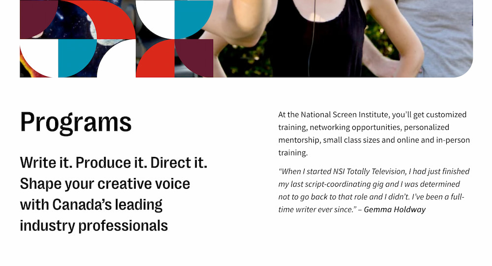
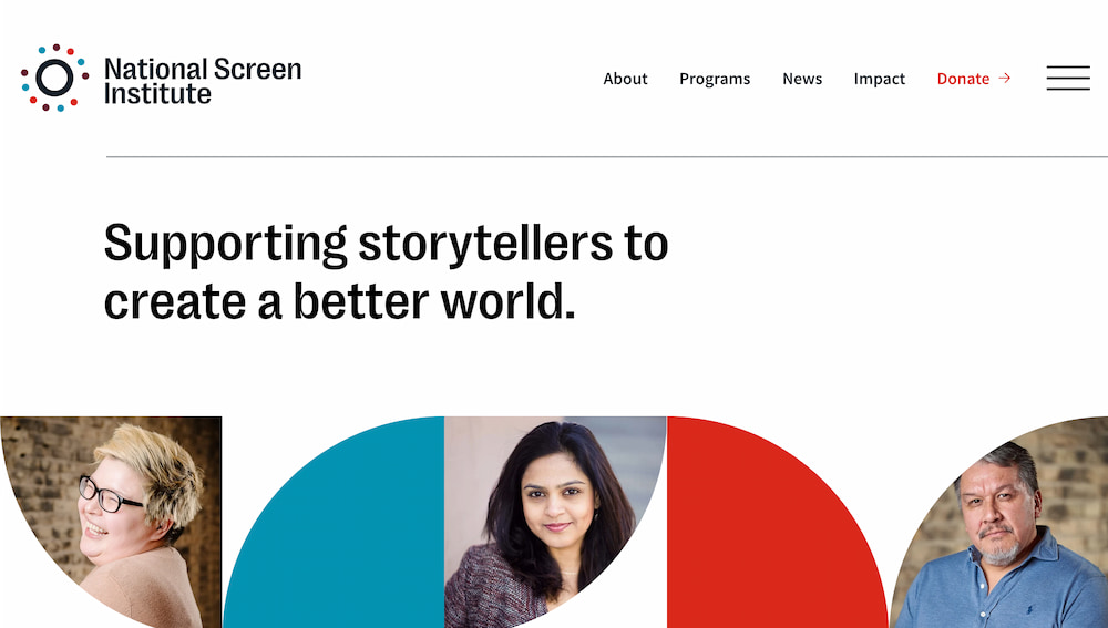
- The NSI homepage features the largest amount of custom layers. Special attention was paid to enable the client to edit easily in the backend. Even the images in the header are able to be replaced at the touch of a button.
Outcome:
Thank you for taking the time to read this case study about my work on this WordPress site! You can visit their website at NSI Canada and take a look at the final product in action.
Looking to get in touch with me? You can email me with any inquirires or questions at . I would be happy to answer any questions and set up a meeting with you.
